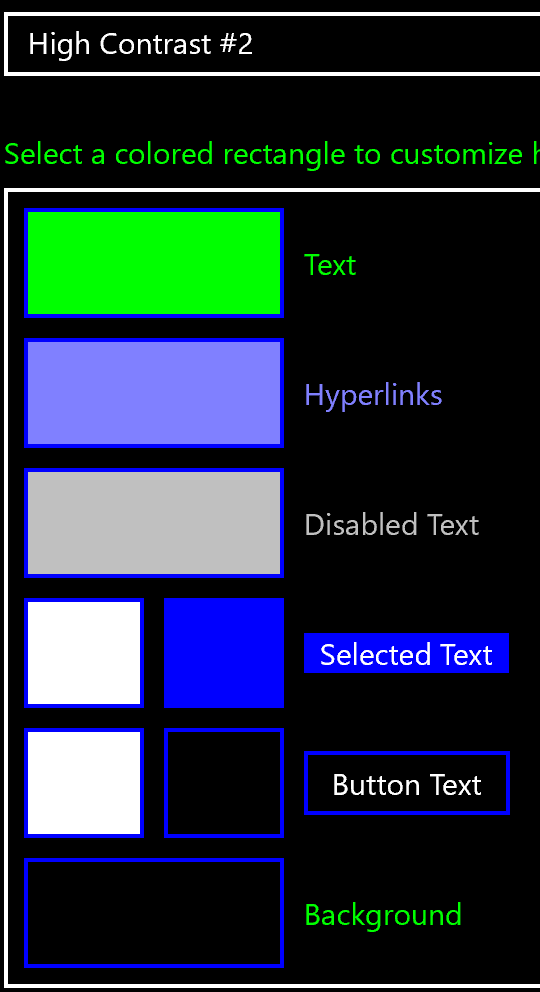
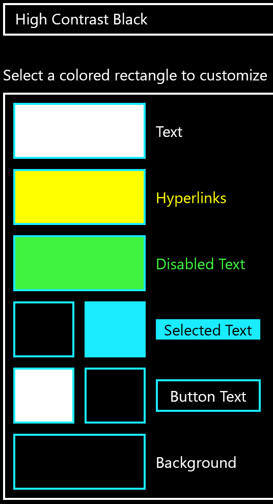
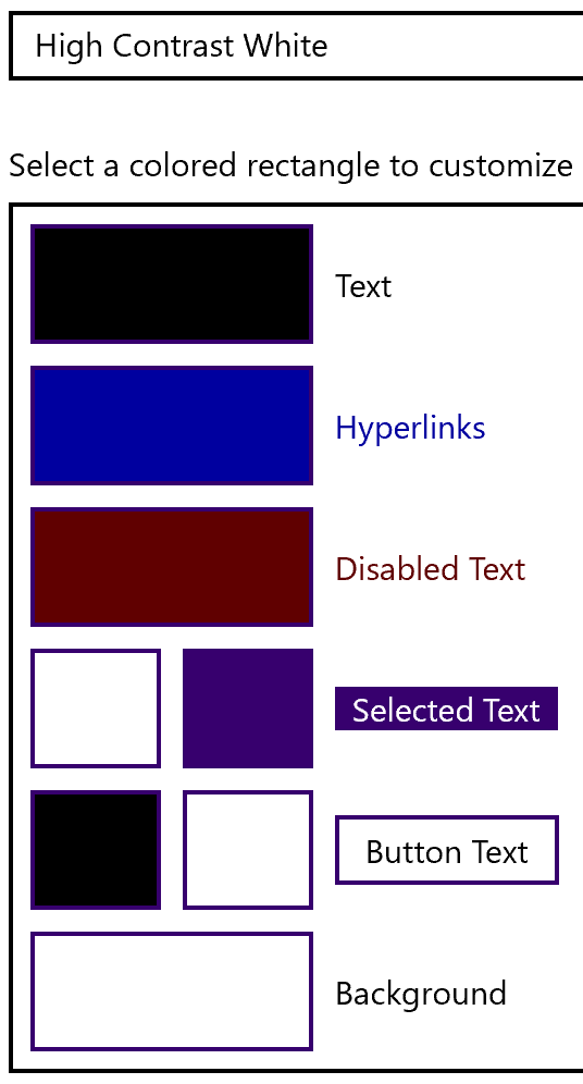
contrast button

Contrast

Contrast allows you to adjust the contrast between text and its background. It also removes shading of tabs and other parts of the screen that reduce contrast. 

Contrast works differently on Macs and PCs and is adjustable.

Quick Demo

More About Contrast…

Play video

How to adjust the contrast

To adjust the contrast – right click on the Contrast button and choose “Settings”. 
This will drop you into the control panel where the contrast adjustments are located. 

Use the control panels on Mac and PC to adjust the contrast to what you want. 
Then use the Contrast button on the MorphicBar to turn it on when you need it, off when you don’t. 

The contrast works differently on the PC and the Mac.  The PC allows much more control and options than the Mac.  

  • On Windows 10
    • High Contrast #1
    • High Contrast #2
    • High Contrast Black
    • High Contrast White
    • You can choose between 4 pre-defined contrast types that will make text look like the following:

High contrast imageHigh contrast picture 2High contrast blackHigh contrast white

  • You can also create your own contrast scheme, including high and low contrast schemes, to any degree you like. 
  • Once you have set the type of contrast you want – the MorphicBar Contrast button will turn it on and off as you want or need it.  
  • On a Mac
    • Increase Contrast  
    • Reduce Transparency (makes see through backgrounds opaque)
    • The slider which allows you to adjust the amount of contrast
    • There are fewer contrast options.  They are mixed in with other controls on the Display portion of the accessibility panel.   
    • The settings that affect contrast (and are turned on and off by the Contrast button on the MorphicBar) are: 
      • Increase Contrast  
      • Reduce Transparency (makes see through backgrounds opaque)
      • The slider which allows you to adjust the amount of contrast

               Frequently Asked Questions

Click a question below...

When you click, you will see more information.

1. Can I get low contrast settings as well ?

Yes. You can go to the Contrast settings and adjust them. Just right click on the control and select settings. They will work across applications. 

Windows gives you the greatest ability to adjust contrast. There are no pre-made low contrast settings. You can control the colors of the different parts of what appears on the screen, and make up your own contrast scheme. You can set the colors for text, hyperlinks, disabled text, selected text/highlight, button/text, and background color. 

Some people find that turning on Night mode (which makes the screen look a dull yellow color) reduces contrast for them – especially if they adjust it to be a stronger night mode.

2. How can I learn more about the contrast settings?

You can go to the accessibility page at Apple and Microsoft (accessibility.apple.com, accessibility.microsoft.com).

But a better way might be to go to YouTube and search for “Accessibility” and “Windows” or “macOS” and the word “contrast”.

3. Why does my app not show up using the colors I selected?

Unfortunately, not every app follows the operating system contrast settings. You may be able to use a different app: for example, the Chrome browser displays in the standard colors while Edge uses your high contrast settings.

4. One of my apps got stuck in the high contrast color scheme. What can I do?

Most apps will change colors after a few seconds. If not, you can try closing the app and opening it again.